I was lecturing last night on e-business web site design. In the first hour I talked about making a business case for a web project where I talked about business goals, process reengineering, return on investment, etc. I told the students that their “project proposal” was not about building cute websites, but about building cost effective systems that advanced business goals and provided a strong return on investment. Later in the class I turned my attention to various techniques and architectures for styling HTML and XML. It covered the structure and scope of Cascading Style Sheets (CSS) 1 and 2 and a comparison with XSL/FO (The XML StyleSheet Language/Formatting Objects). In the process of the lecture, there were a number of times that I digressed into an presentation on font metrics and design issues that were more about aesthetics than ebusiness productivity. I think the lapses in focus may have been due to several discussions I have had with colleagues about courses on interface design have migrated to courses on web design. I won’'t digress much here from the topic of aesthetics, but suffice it to say that when I built the course on interface design years before the web, the focus was on a variety of principles and techniques for building quality interfaces –-- i-phone type interfaces that wrap around humans. For the most part, the web is the worst place to teach these principles and most of what people do on the web makes quality interface designers shudder. But back to font metrics, web design, and aesthetics.
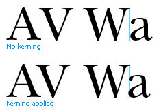
Back in the early eighties I was heavily involved in the design of formatting software for the early laser printers heavily influenced by the challenges of achieving high quality graphic effects using low resolution laser printers. We thought a lot about type design, kern pairs, hyphenation algorithms, automatic page layout, white space allocation, etc. Last night, the lecture on style sheet design caused me to digress to aesthetics as I touched on several of these points. Let me give just a couple examples. When certain proportionally space characters are juxtaposed, the result is aesthetically poor. As I recollect, the three most frequently occurring combinations are Yo We Ta. Compared to say ll or TT, the apparent space between Y and o in Yo is too great and o needs to be “kerned” or moved back toward the Y to make the spacing look right. Thus, You looks better with kerning. I don’t think I have every heard a concern in web design about the effect of kern pairs.
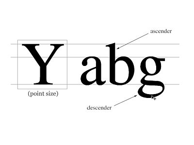
The next digress came in talking about font size – as measured in points. This lead to a discussion of ems, picas, and x height. The measurement of font size derives from the size of the block of metal type on which the character was placed. In the image, the box surrounding the Y represents the type slug. You can see that if that box is 12 points high – a point is about 1/72.27th of an inch. Rounding a 12pt font is 1/6th of an inch and a 36 point font is ˝ of an inch. Beyond that trivia, good type design assigns different x-heights (the height of those components of a font that fill the area of the small letter x. For example the “bowl” of the letter b in the image is determined by the x-height of the font. Open Word, type “goodbye my darling”, highlight it, select format font, set the size at 12 pts, and scroll through 30 or forty type faces, watch the relative size of the o’'s and ask yourself how it impacts readability. There will be a lot going on, but generally, relatively larger x-height tend to make fonts more readable.
Similarly, the mixture of font types (serif and san serif) for headings and body text can have an impact on both readability and page indexing – the ability to quickly scan for topics and text. How many web designers mix the font styles, heights, metrics colors, not to mention use padding and spacing to impact the accessibility and readability of a page. Of course many of the pro’s do, but I suspect that has more to do with graphic designer oversight that with web page designer knowledge.
We have gained much by moving to structural copymarking and by automating much of the display technology, but I fear we have lost, or failed to pass on to the new web designers much of what we have learned about the aesthetics and readability of text. I am not complaining about the progress we have made in computing and document processing. I love this brave new world. I am suggesting that it has made all of us, myself included, a little more lazy and complacent. In the August 2008 edition of Communications of the ACM, Donald Knuth talked about the publication of Volume 2 of The Art of Computer Programming:
One of the greatest disappointments in my whole life was the day I received in the mail the new edition of The Art of Computer Programming Volume 2, which was typeset with my fonts and which was supposed to be the crowning moment of my life, having succeeded with the TeX project. I think it was 1981, and I had the best typesetting equipment, and I had written a program for the 8-bit microprocessor inside. It had 5,000 dots-per-inch, and all the proofs coming out looked good on this machine. I went over to Addison-Wesley, who had typeset it. There was the book, and it was in the familiar beige covers. I opened the book up and I'm thinking, "Oh, this is going to be a nice moment." I had Volume 2, first edition. I had Volume 2, second edition. They were supposed to look the same. Everything I had known up to that point was that they would look the same. All the measurements seemed to agree. But a lot of distortion goes on, and our optic nerves aren't linear. All kinds of things were happening. I burned with disappointment. I really felt a hot flash, I was so upset. It had to look right, and it didn't, at that time. (CACM, August 2008, 51(8) page 33)
Professor Knuth reminds us that it is not only the content we produce, but the presentation of that content that is important. If Donald Knuth believes it is important enough to devote a decade of his productive energies to better presenting his brilliant work on algorithms, I would suggest the it behooves those of us less prolific in the production of significant new content to spend some time to understand and implement techniques for aesthetic presentation of those meager ideas we wish to share.